Followers

Thursday, 6 January 2011

Evaluation

I have found this project exciting and enjoyable, as I haven't really done re-branding to this extend and because of the volume of work I've had to produce, it feels more like a live brief. I am very pleased with my final overcome of my vector mural, as I originally didn't plan that root of illustration for my mural but now I feel it shows my city very clearly. As it does throughout my menu designs; pyramid shape and hieroglyphics wine label. 


After different colour variations the background colour outlines and the figures full colour black outline is eye-catching and illustrates my city and also putting the 6 bowls in full colour and added my own version of the YO! sushi logo, to emphasize the brand in the mural.


My menu design, is a practical 3D design. 3 pyramid shaped menus that fit inside each other like 'russian dolls' so it doesn't clutter the table area. That use elements from the existing Yo Sushi menu, arrows and plates.


My wine label, i decided to use part of my menu to create just a thin label which goes horizontal down the bottle.


My direct mail, i decided to use the 3D paper folding number game, so i to use  the coloured plates like on the menu which made it looks a lot more clean and it keeps continuity throughout the designs.

Overall I am very pleased with all my outcomes, as i feel i created my own style that it continued throughout which is aesthetically pleasing, practical where needed and fitting with my Yo Sushi Egypt.

Tuesday, 4 January 2011

Direct Mail ideas

Direct mail campaigns


Direct mail is usually a boring letter, leaflet that appears with your post which ends up in a draw or the bin, because it isn't that appealing or eye catching.


Existing Yo Sushi Campaigns


Yo Sushi are using the credit crunch for there current campaign and got a variety of offers on; 2 for 1 on cocktails, 25% off for students etc.


There also doing a 'win a £1000' for just giving them feedback on your meal online.


Idea


Staying with the 3D paper theme ( pyramid menus) i thinking of creating a direct mail campaign that you can interact with. Im going to adapt the paper number game or fortune teller. Also as my target audience are tourists, Im thinking of placing these either on the plane or in the hotel welcome packs.


With the design its just a square piece of paper that has a series of folds. The numbers 1 -4 always stay the same but underneath the number flaps can be anything. I originally had text in the place of the coloured plates, saying sorry try again and one saying won free starter but i decided that the coloured plates like on the menu looks a lot more clean and it keeps continuity throughout the designs.


So in theory pick a number, lift the flap, get a empty plate no free meal or get a plate with something on it you get it free, when you come into Yo Sushi Egypt.


Wednesday, 15 December 2010

Wine Bottle ideas


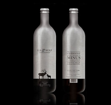
These are some bottle that i found whilst researching into wine label design and i thought they were appropriate for my vector style. I thinking of using part of my original mural but using the colours from the top image.  

Bottle Shapes ideas

I looks at different shaped bottles, that might go with my chosen city. I want my bottle to be a bit different from the usual shaped wine bottle.


Chosen bottle shape


I have decided to change the traditional wine bottle shape, for a more hour glass shape.


Tuesday, 23 November 2010

Typefaces


Yo! sushi used Helvetica for heading and descriptions of dishes in there existing menu and use Japanese page headers to reinforce the brand.


These are the typefaces that i have been looking at to use in my menu and i have decided to use Samarkan font, bottom right.


Thursday, 11 November 2010

Menu design ideas


Outline design of my menu that folds into a 4 sided pyramid and the 5th side folds under. As the menu has alot of content, i decided to pick sushi, meaty, veggie, drinks and how it works.


Change of net


I have decided to change the plan from a 5 sided to a 3 sided because from a practical view a menu is handled alot and menu's that folds out tend to get tatty very easily. So with this design the sides will be fixed. Also there will be a large, medium and small pyramid that fit inside each-other like 'russian dolls'. The large one will have sushi, meaty and veggie like the original design, medium will have deserts and the small will have drinks. 


existing menu


Original Full cover

1 layout style

 linear style layout

3 column grid


Friday, 5 November 2010

Final mural


After different colour variations i have decided to go with the background colour outlines and the figures full colour black outline. i have also put the 6 bowls in full colour and added my own version of the YO! sushi logo, to emphasize the brand in the mural.


Mural in outlet


Thursday, 21 October 2010

Mural design ideas


outline design

with arrows


with chopsticks

part colour

outline colour,  people black outline


Change of plan and Brand Management Report

After some thought I've decided not to use my chosen artist style for my wall mural. Ive decided to use an existing Ancient Egyptian mural style but adapt the yo sushi corporate style. I saw a connection between the mural hieroglyphics in columns and the yo sushi menu in a column grid system. So im going to recreate Egyptian style vector mural but using the bright colour scheme of Yo Sushi. I will also included a coloured bowl symbol, a fish symbol and chop sticks with the hieroglyphics to enforce the Japanese feel. 


Brand Manager report


The Sushi – Japanese-style raw fish with rice and vinegar was quite a small market in the UK in 1997. Furthermore, most restaurants in the UK certainly didn’t serve their food on conveyor belts! Simon Woodroffe, founder of YO! Sushi, took the risk to be different and opened a conveyor belt restaurant specialising in sushi. The customers loved it and found it fun. 

The new brand aim after a recent management buyout is ‘ no two YO! Sushi restaurants or outlets should be the same’ So the idea is to have each outlet, worldwide to have there own individual and unique identity relating to there city. Brand each YO! Sushi into its destination. 

YO!  Sushi  is  based  around a fast food restaurant , like McDonalds but higher class which narrows the target audience and makes it more important for the whole interior feel to be modern and fresh, as the target audience is mainly 18-25. After the recent buy out the whole company philosophy has changed ‘ No two YO Sushi! restaurants or outlets should be the same’ Which goes back to my views that the location and surroundings play a large amount into the design of the mural. As cities attract tourists of all ages for there landmarks, architecture and culture this means the mural style should be such a distinctive style to attract the younger tourists.


There selling points are unique, the innovative format of a YO! Sushi restaurant gives people the chance to eat in a Japanese sushi bar adapted for the West, enjoying a quality, fast and fun dining experience where customers pick and choose their food from a conveyor belt in front of them. If you miss the dish the first time – wait for it to come round again! and thats how you YO!

From researching into various cities, I have decided Cairo for my location of a YO! Sushi. Cairo hasnt got its own individual vibe like other cities like the night life of Las vegas for an a example but for me personally I feel you go to cairo for the history; the Nile, Valley of the Kings, the ancient parts. People instantly think pyramids, the Nile, Tutankhamun, Sphinx, mummies when Egypt is mentioned. I want my mural to include more of these things, the history behind egypt but bring it to the 21st century with an modern illustrative style.  The artwork on the walls inside the pyramids are ancient murals that i feel are really unique, as only the egyptians had burial chambers with these and they told stories about there life. Thats why the pyramids were built before they became pharaoh.

Ive decided to use an existing Ancient Egyptian mural style but adapt the yo sushi corporate style. I saw a connection between the mural hieroglyphics in columns and the yo sushi menu in a column grid system. So im going to recreate Egyptian style vector mural but using the bright colour scheme of Yo Sushi. I will also included a coloured bowl symbol, a fish symbol and chop sticks with the hieroglyphics to enforce the Japanese feel.  

Friday, 8 October 2010

My style

I have decided on a mix of Melanie Armstrong and Ryan David Seaman. Melanie’s style is hand drawn with a black fine liner, then she digital adds burst of colour. Ryan also likes hand made feel to his work with a old paper look. I feel these two illustrators are right for my target audience, as Melanie has worked with ZooYork US Clothing / Skateboard Company : February (2009) and Ryan has worked with True Honor Clothing and RYZ Shoes, which are urban clothing for the youth; the target audience. I would like to recreate this in my mural, the content will be egyptian architecture and history with a vibrant colour scheme and illustrative style but I also want it to feel rustic, like it was on papyrus paper.

chosen city - Cairo, Egypt

From researching into various cities, I have decided Cairo for my location of a YO! Sushi. Cairo hasnt got its own individual vibe like other cites like night life of Las Vegas for an example but for me personally I feel you go the places like Cairo for the history; the Nile, Valley of the Kings, the ancient parts. People instantly think pyramids, desert, Tuthankhamun, Sphinx, mummies, etc when Egypt is mentioned.


I want my mural to include more of these things, the history behind Egypt but bring it to the 21st century with a modern illustrative style. The artwork on the walls inside the pyramids are ancient mural that i feel are really unique, as only the Egyptians had burial chambers with these and they told stories about there life. That's why the pyramids were built before they became pharaoh. I'm thinking maybe my mural could tell a story.


Background and research into cities

I would like to include different attractions from cities in my mural. I want large parts which make you instantly know what city or country the restaurant is placed in but also smaller parts which are obvious at first and make you look closer.


Cities i am looking into : 
  • Dubai
  • New York
  • San francisco
  • Cairo


Dubai


Top of the mind branding
  • rich country
  • Burj Al Arab
  • atlantis hotel
  • Formula 1
  • palm island


Palm island

Atlantis Resort & Hotel


New york

Top of the mind branding
  • empire state building
  • twin towers
  • 911
  • statue of liberty
  • times square
  • Frank Sinatra  
  • Manhattan
  • grand central
  • big apple
  • central park
  • New York Yankees
  • Madame Tussuad
  • Chrysler building
  • I love New york
  • Guggenhelm
  • National History Museum


Brooklyn Bridge

Chrysler Building


Times Square

San Francisco

top of the mind branding
  • golden gate bridge
  • old trams

Golden Gate

City Trams

San Francisco skyline

Cairo

top of the mind branding
  • pyramids
  • camels
  • tombs
  • Tutankhamen
  • mummies
  • gold 
  • desert
  • red sea
  • Nile
  • sand
  • palm tree
  • hieroglyphics  
  • Pharaohs

Camel and sunset

Pyramid